Scrabble
UX | Design Research | Innovation
Sector
Mobile apps, ios, games
Challenge
Choose an app or digital product/service existing on the market; highlight the process and approaches towards improving it.
Project Time
5 days
Brainstorming directions
I have started by exploring a number of apps and web products that could be considered as a use case for this particular challenge.
- Mobile games
Arcades, Board Games, Action - Apps
Music, Healthcare, Booking tickets, flights - Web
Retail, News, Social Networks, Video Streaming
For making a decision upon which product to work on, I've considered the following metrics:
- genuinely interested in, which would support my motivation
- engaging, playful
- viable to investigate based on available resources
- opportunities and commercial potential
- popularity/use
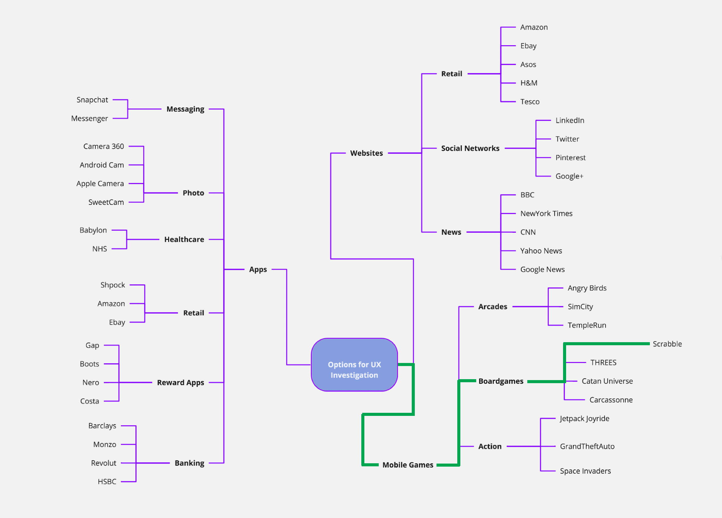
Mind mapping various options to explore.
Approach
Considering the limited availability of specific resources like time, I have selected a number of techniques from each of the UCD phases that would be appropriate for the current project.
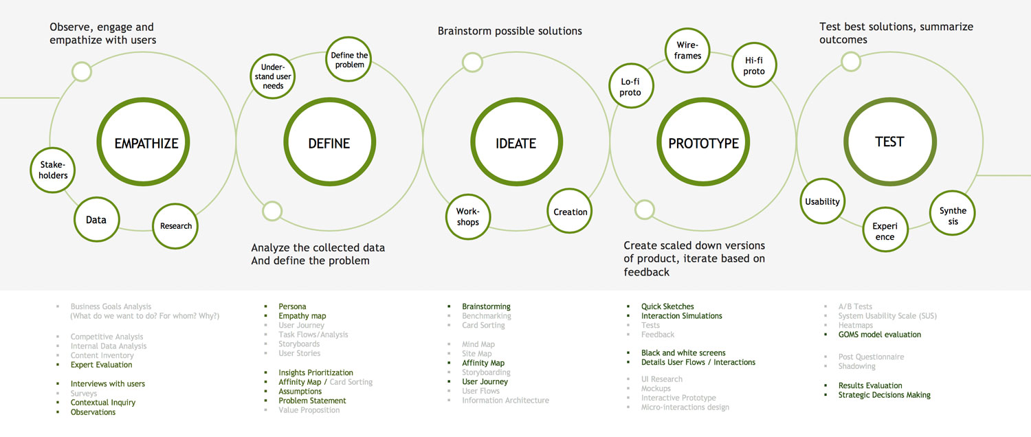
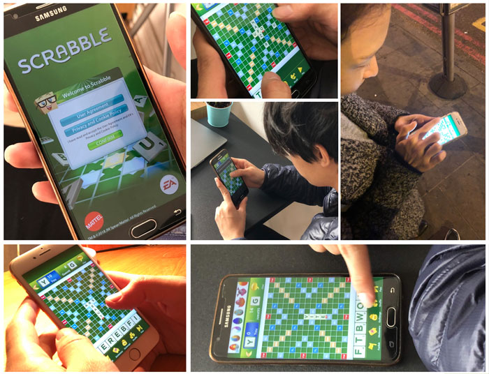
Building empathy
In this phase I have collected user data by conducting moderated interviews and short tests with a sample of 5 people who are familiar with the scrabble game and mobile technologies. To reduce gender bias, I have approached both men and women in an equal proportion. While a small sample of participants might be less representative for the whole product audience, it is generally efficient in collecting anecdotal evidence for potential opportunities and identifying major usability concerns.
Highlights from contextual inquiry and observations
- “after I make my move, I need to wait for the opponent, which might take a long time, so I just close the app”
- “oh… why it doesn’t work now [no internet]”
- “it makes me feel stupid.. It’s too complex [app]”
- “I didn’t know such a word exists.. What does it mean? [plays a word]”
- “it makes me feel inexperienced.. It’s too complex [trying to make a move]”
- “I don’t see where is the word I entered” [when navigating around]
- “I don’t know what to do now, I’m confused” [trying to create a new game]
- “I can’t see where is my chat.. Is it lost?” [after the game has finished]”
- “I don’t like these ads, they are annoying.. ” [after each move notices]“Is this even a valid word?” [opponent plays his turn]
- “Why do I have to see these ads.. Can I skip it? [irritated]”
Personal Experience/ Expert Evaluation
- Consistency Issues in multiple screens (ex.: back button, exit cross sign)
- Inefficient use of space (ex.: top/bottom parts of the board)
- Game settings located in a wrong menu category
- After checking the word in dictionary it resets the input
- Game stats are visually heavy and cluttered
- Defining the problem space
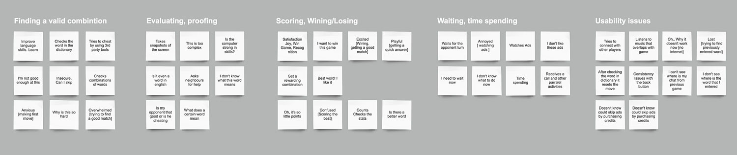
After collecting the compound feedback from all interviews and observations, for a better understanding of the users and their needs I have aggregated the quotes, and plotted them further on an empathy map.
This has helped to identify emerging topics about what do the user feel, think, say and do while using the product, which then leads to definition of common pain points and desired outcomes.
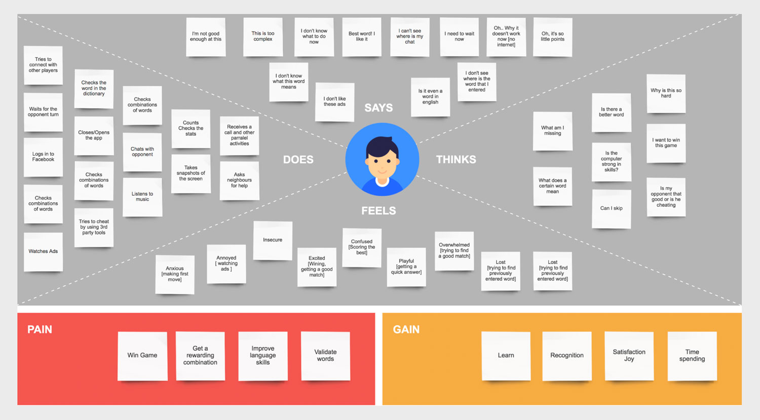
The emerged clusters formed four distinctive sets. Experiences were related to the struggles of finding a valid combination of letters, validating a currently entered word, inefficient time spending between the moves and a number of usability issues.
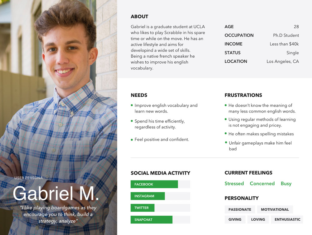
To visually portray a real user of the game and help to focus decisions about app improvements based on the analysed research data, I've aggregated the findings into a persona.
This is also helpful for:
- stakeholders and leaders to evaluate new site feature ideas
- develop informed wireframes, interface behaviours, and labelling
- system engineers/developers decide which approaches to take based on user behaviours
Aspects to focus next would be related to the identified pain points and needs of the user, which sum up to:
- support learning new words
- improve efficiency of using the product
- create positive emotional states
Ideation
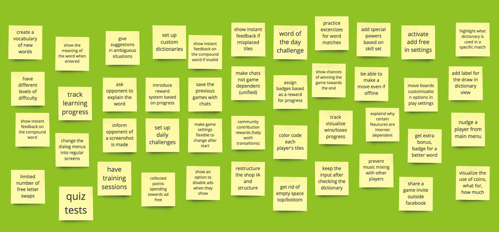
After identifying the main dimensions from research, I used brainstorming technique to elaborate a number of visual and structural changes that could be applied to the app in order to fit better the user needs.
Informing UX Decisions
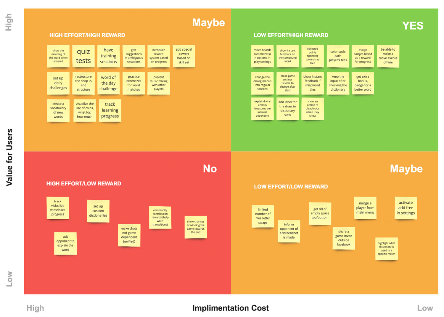
The reality is that not everything can be done at once and making an informed decision on what to prioritise can be daunting.
A prioritisation matrix serves to identify the most important problems. This structured, objective approach helps achieve collaborative consensus while satisfying the varied needs of the user and business.
I have plotted on a 2x2 matrix the core ideas from brainstorming, based on two metrics: the value for the end users and the difficulty of implementing it.
In a collaborative environment, together with development teams, this approach helps in deciding the order in which to implement the discussed features in a way that would benefit all parts involved.
Improving user flows with task analysis
- Helps to understand user behaviour by describing the actions that users perform to achieve the goal
- Helps identifying unnecessary steps
- Helps defining the taxonomy and interface
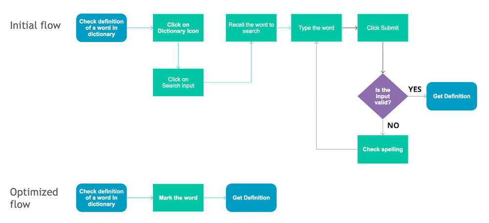
I have build the task analysis diagram to illustrate the current sequence of tasks performed by user for checking the meaning of an available on the board word in the dictionary.
This has helped to ideate on a better approach as of how this could be simplified and merged with the ideas from brainstorming.
Prototyping
I've started with low-fidelity sketches to reflect how various ideas related to previously identified opportunities could be implemented.
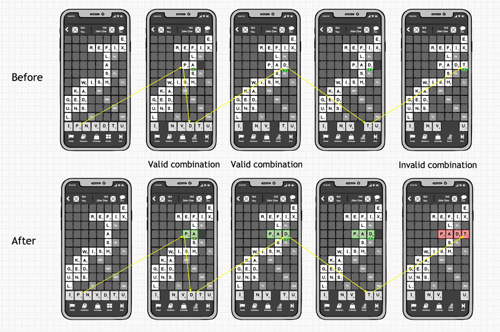
Adressed Drawbacks:
- Users can’t see where is the word that they are currently building
- No feedback regarding the validity of the assembled word
- The score is displayed even if the word is invalid
Suggested Improvements:
- Highlight the word that is currently assembled by using a border and a distinctive background
- Check word validity “on the fly” and provide instant feedback by using two distinctive colours for valid/invalid input
- Disable word score display in case of an invalid input
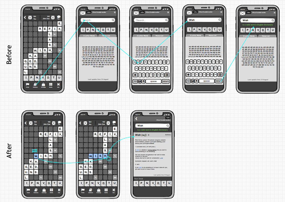
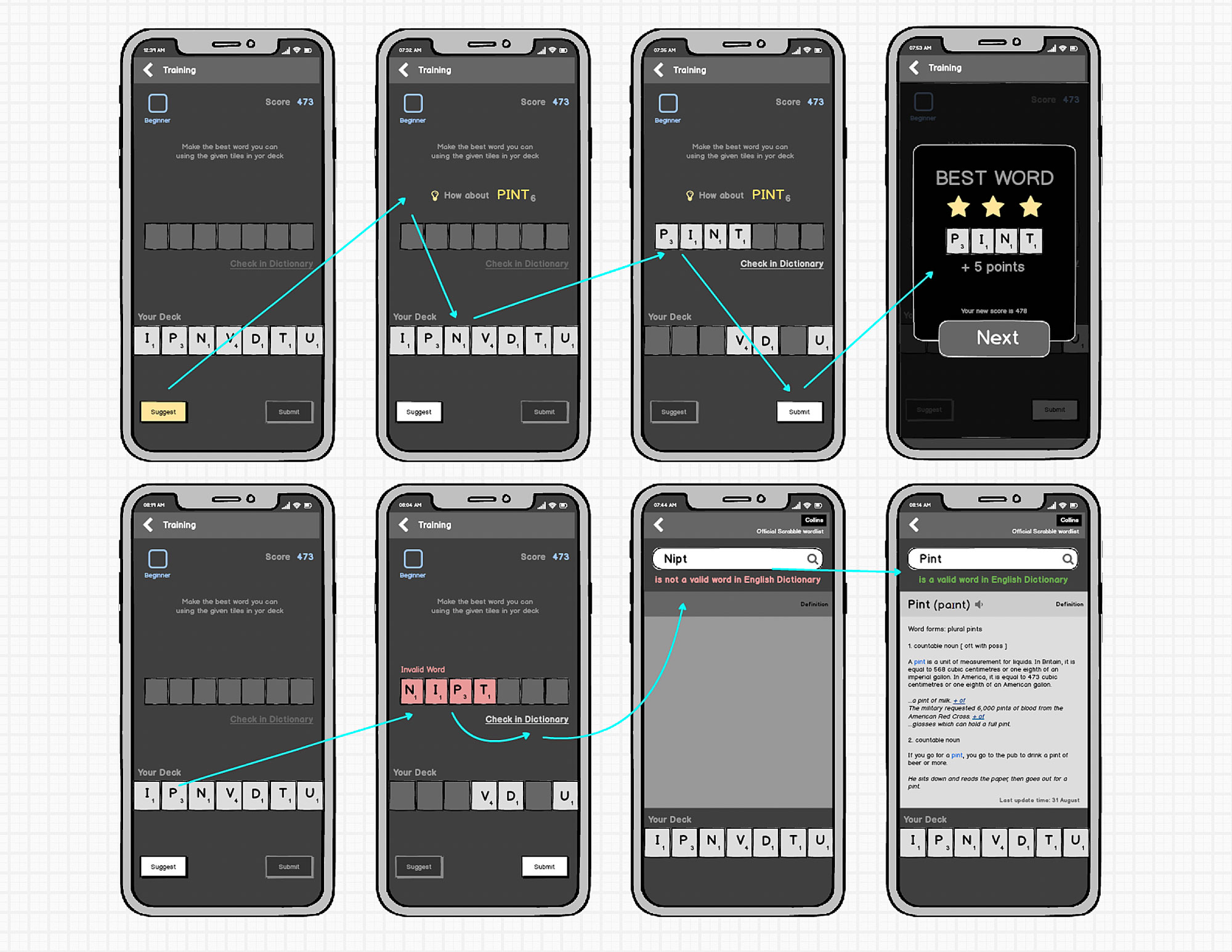
Checking the meaning of a word available on the board in the dictionary
Adressed Drawbacks:
- Checking the word takes a significant amount of steps
- This task relies heavily on the “recall” of information by the end user
- The dictionary view has inconsistent navigational elements (close icon)
- The deck is located inconsistent with the game view
- The user can only check the validity of word, but not it’s meaning
- Tiles interactions are disabled
Suggested Improvements:
- Tap and slide on a word to highlight it which triggers the move to the dictionary, minimising the number of interaction steps, pointing, doesn’t require the user to recall the word
- Eliminate the close button and place a back button
- Eliminate the flag image (declutter interface)
- Display the definition of the word from the dictionary
- Relocate the deck at the bottom of the screen for consistency
- Allow tiles interaction as in game (shuffle)
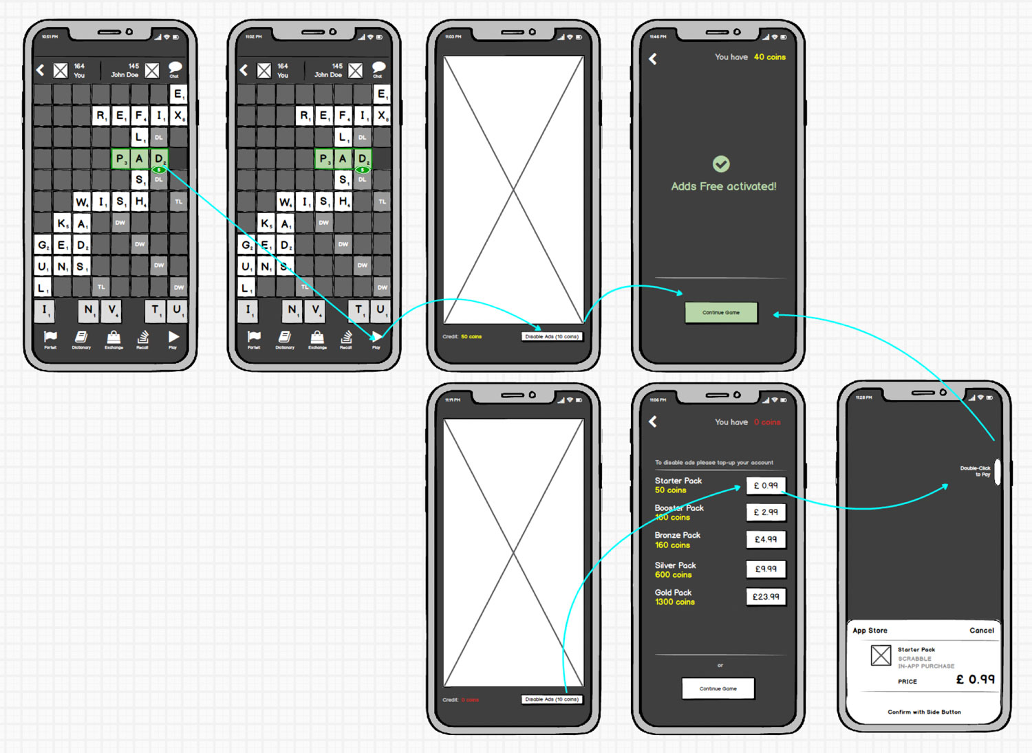
Using available credit for disabling ads
Adressed Drawbacks:
- Users have to watch adds by the end of each turn, if the game has already started
- Ads can be deactivated only for one type of gameplay and ONLY before starting it
- Purchasing credit is available only in store, outside of gameplay
Suggested Improvements:
- Add ability to disable ads during gameplay
- Ability to disable ads regardless of game type
- Add shortcut for purchasing credit from gameplay if no coins are available
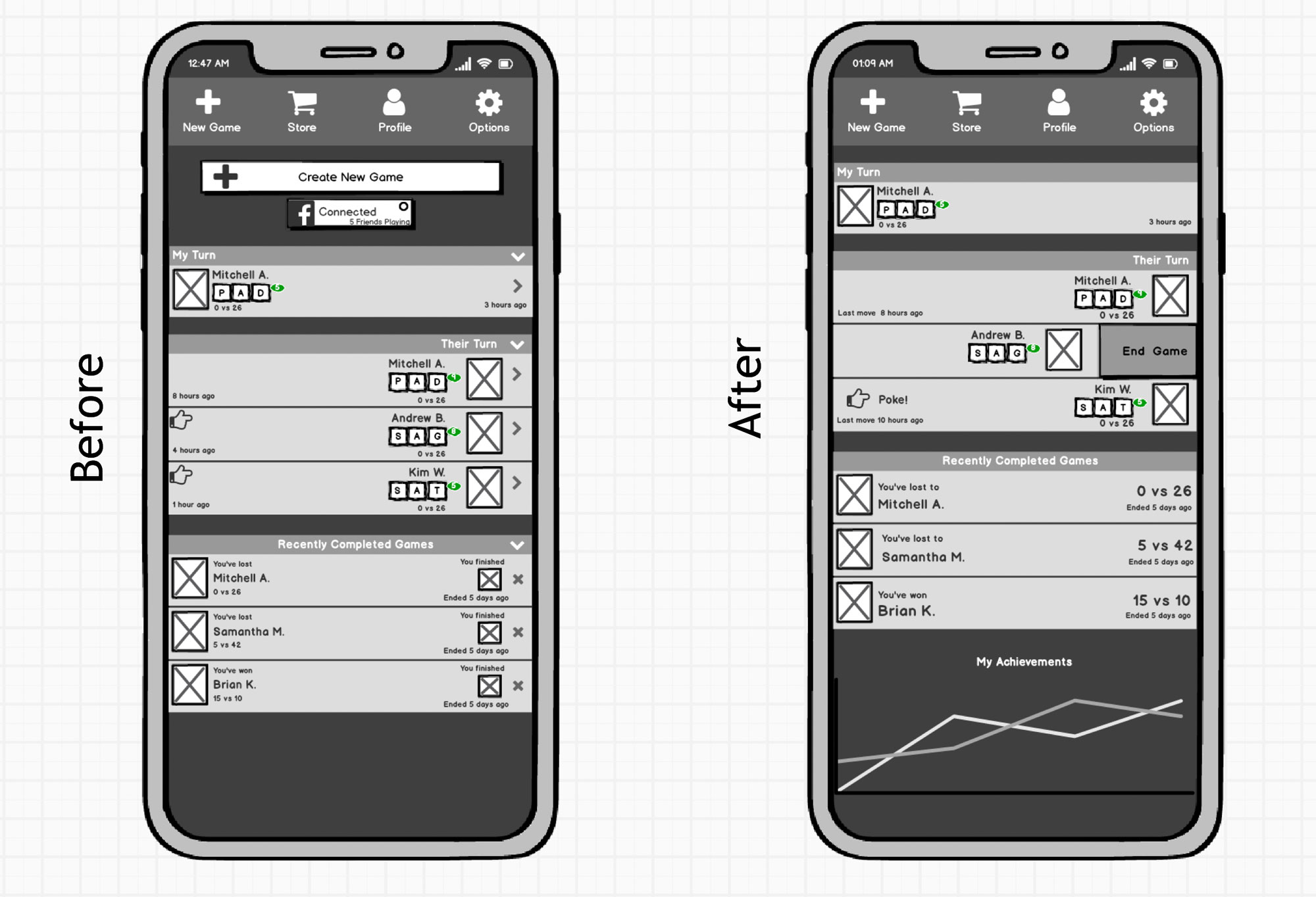
Other UX opportunities
Adressed Drawbacks:
- Cluttered main menu, visual noise
- Redundancy in interface elements
- Inconsistent interactions with OS guidelines
- Various Usability issues
Suggested Improvements:
- Add support for native iOS list element swipe for properties (delete, end game etc)
- Remove redundant elements (new game)Remove extra information
- Make ”Poke” clickable from main menu
- Add game stats for wins/loses
- Remove extra images for completed games
- Remove collapsible icons
- Remove the close icon for recent games
- Make game score more visible
New Feature: Training mode
Opportunity: Help users develop their scrabble skills while also learning new words
Suggested Improvements:
- Provide a Training Mode gameplay that primarily aims at improving skills for building words
- Track user’s progress in learning new words
- Assign Badges based on skills as a reward
Testing the efficiency of proposed designs
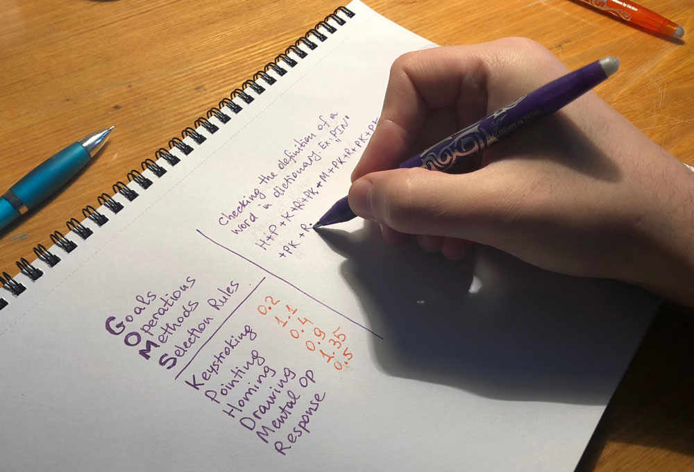
KLM-GOMS (Keystroke-Level Model) uses empirically derived values for basic operators like keystrokes, button presses, double clicks, and pointer movement time to estimate task times in seconds.
In this way we can compute and compare how have the applied changes affected the time required for executing common game tasks.
Additionally, User Experience feedback could be captured through A/B tests with users by getting more qualitative and quantitative data.
This could be achieved by translating the prototypes in an interactive environment i.e Invision app, giving the users to perform specific tasks within a certain scenario and measuring the time, comments and attention spots (for instance heat maps).
Outcomes
- Optimised user flows and efficiency
- Faster checks for word in the dictionary. Speeded up by 4.6 times (11.05s down to 2.4s)
- Instant revenues by purchasing ad free options after any move increases users satisfaction + boosted sales
- Usability improvements: Cleaner interface, improved consistency, navigation
- Training mode for boosted users proficiency and confidence
- Removed ambiguities (instant feedback)