Improving onboarding at Tray.io
UX | Research | Design Workshops
Sector
Automation, low-code, web
Challenge
75% percent of prospects were dropping off during the time of first use, which was resulting in high costs for sales and customer success teams.
My Role
Lead Product Designer
Design Process
Quantitative and qualitative research, collaboration with sales and customer support teams, journey mapping, concept generation, prototyping, feedback and iteration on designs.
Outcome
40% TTV (time to value) improvement
🎯 Project Overview
At Tray we noticed a worrying trend: nearly 75% of new users disengaged before creating their first automated workflow. This case study walks through how we identified the core usability issues and redesigned the onboarding experience — resulting in a 40% improvement in Time to Value (TTV) and a measurable increase in product activation.
🧩 The Challenge
Tray.io is a powerful platform — but with great power comes complexity. New users, often without a technical background, were overwhelmed by the interface. The default experience dropped them straight into a blank canvas with minimal guidance. Some prelimiray data was suggesting that
only 1 in 5 trial users were able to successfully built a working automation during their first session.
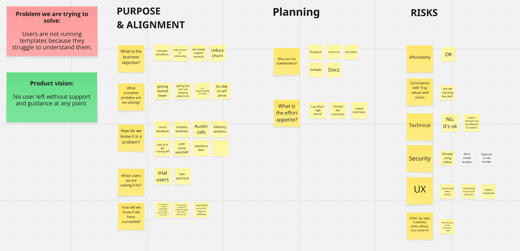
We kicked-off for this project by emphasizing the alignment with Tray's core values and vision, focusing on affordability and the need to address specific user challenges. Key discussions revolved around the risks associated with limited timeframes and development resources, while maintaining a low-effort, high-reward approach.
🔍 Discovery & Research
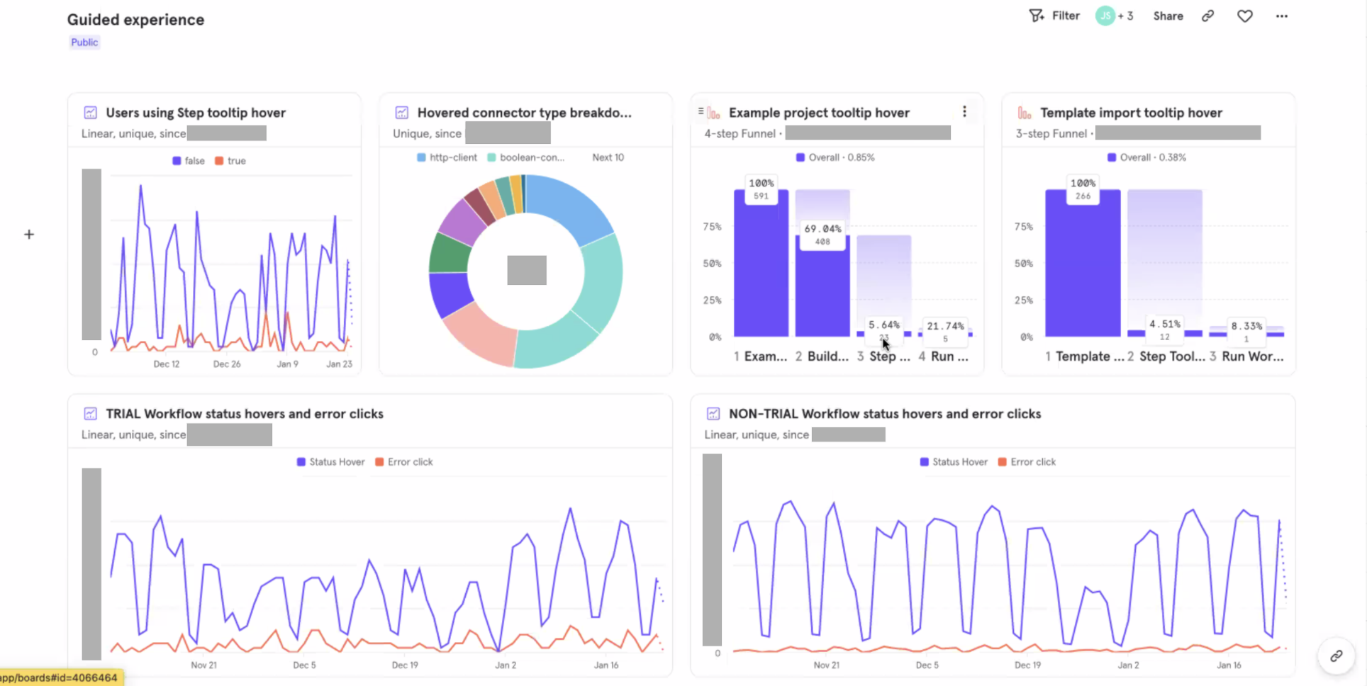
To understand the friction points, we conducted both quantitative and qualitative research:
- Collaborated with customer success teams, product managers, and business analysts.
- Analyzed user interactions with existing guidance mechanisms.
- Mapped the customer journey for trial and new paid customers.
- Funnel analytics to pinpoint drop-off stages
Key Insights:
- Users needed contextual guidance immediately after selecting a template
- The empty workflow editor felt intimidating
- Many expected more clarity around what exactly their automation would do
As the Lead Product Designer, I facilitated workshops with cross-functional teams, including PMs, engineers, and customer success managers, to align on user needs and business goals. For each step in the customer journey, we specified customer expectations, needs, and mapped both positive feedback and pain points that we were recieving from various feedback channels.
We then reframed the negative insights into actionable “How might we…” questions to shift the focus from problems to opportunities. This approach allowed us to ideate a range of targeted solutions that directly addressed the core user frustrations while aligning with business goals.
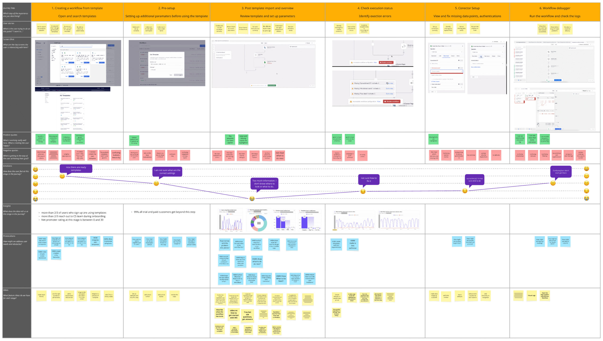
A significant drop off has been noticed at the stage right after customers would create a workflow. This was due to limited guidance on how to set up the workflow, highly technical interaface options, complex debugging and limited overview of errors.
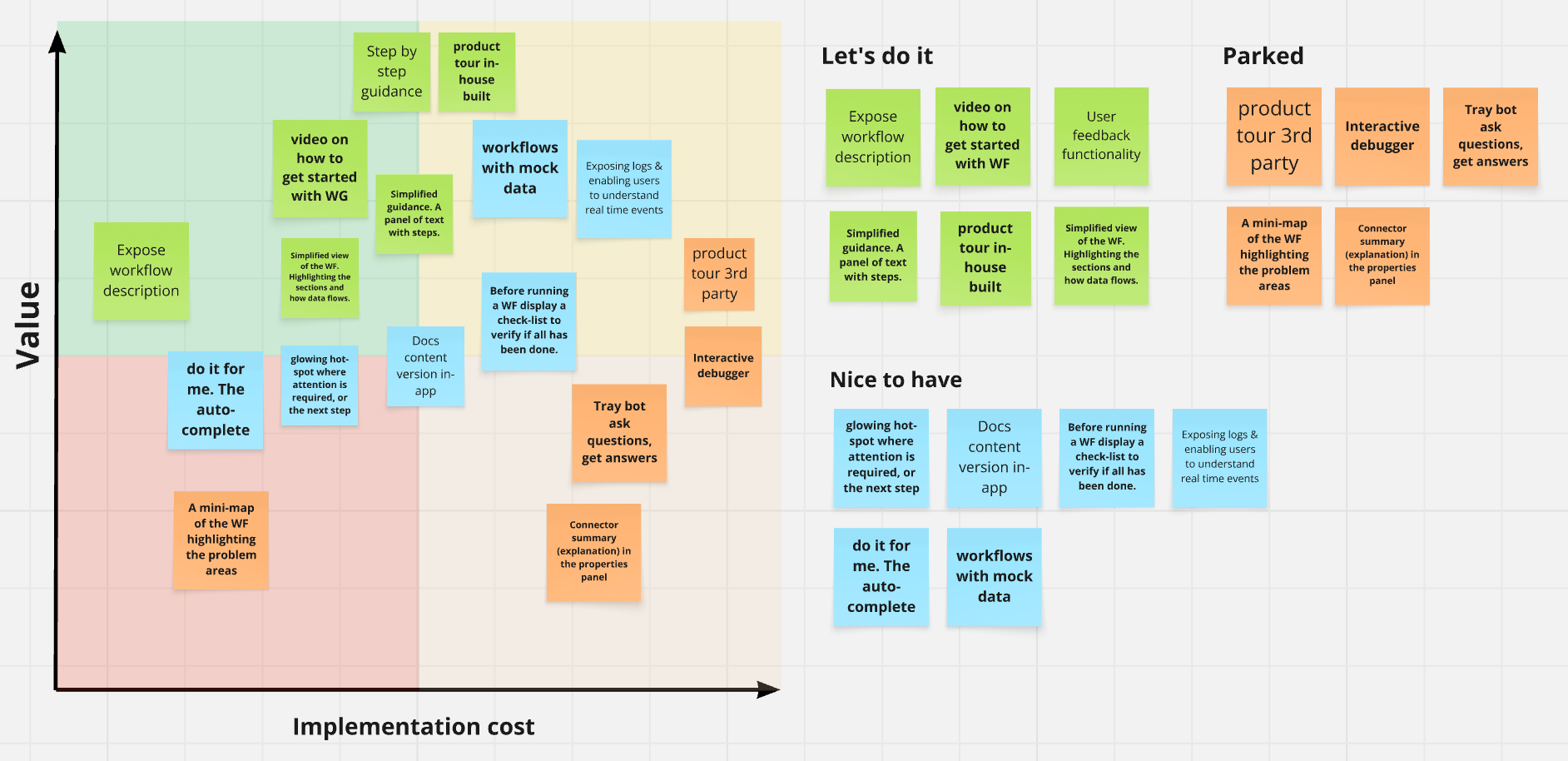
🎯 Prioritization and Potential Deliverables
We employed a prioritization matrix to evaluate proposed solutions based on impact and implementation complexity. This process helped us categorize ideas into:
- Must-haves: Low effort, high value.
- Nice-to-haves: Dependent on available resources.
- Parked ideas: To be revisited later.
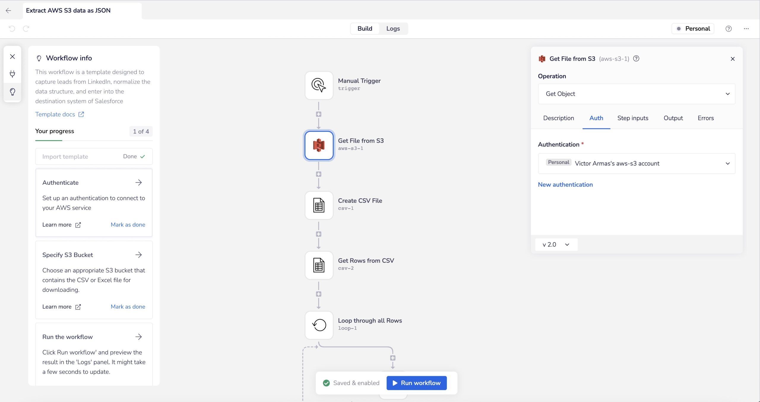
One key solution was the development of a side panel block to guide users post-template import or new workflow creation.
🛠️ Design Approach
With a clearer understanding of where users struggled, we focused on a few key improvements:
- Contextual Guidance Panel
We added a dynamic side panel that walked users through setting up each step in their workflow, tailored to the selected template. - Progressive Disclosure
Instead of overwhelming users with complex configurations up front, we broke onboarding into smaller, achievable chunks with immediate feedback. - Smart Defaults & Tooltips
We pre-filled certain fields and added micro-interactions to explain inputs — lowering the barrier to entry.
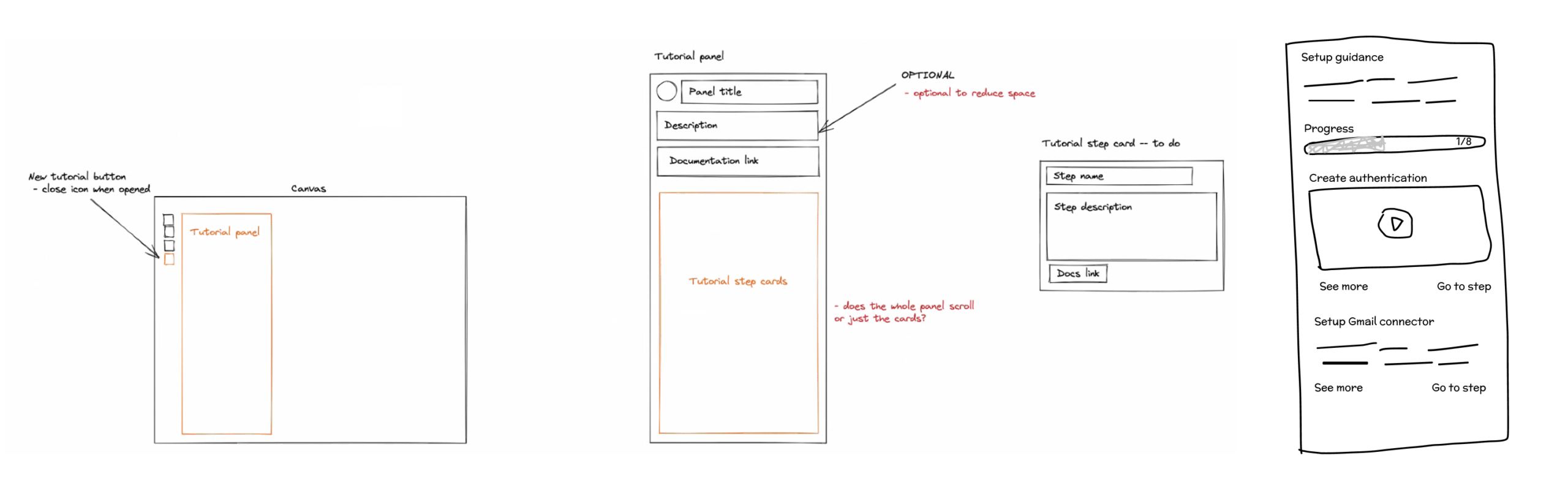
✏️ Low-Fidelity Sketching and Requirements
We brainstormed implementation options for the side panel, focusing on:
- Component details and various states.
- Interaction patterns.
- Reusing existing components and styles.
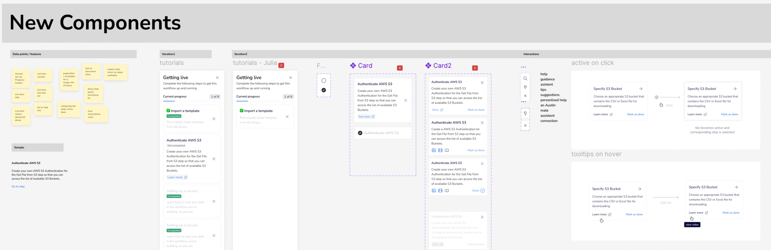
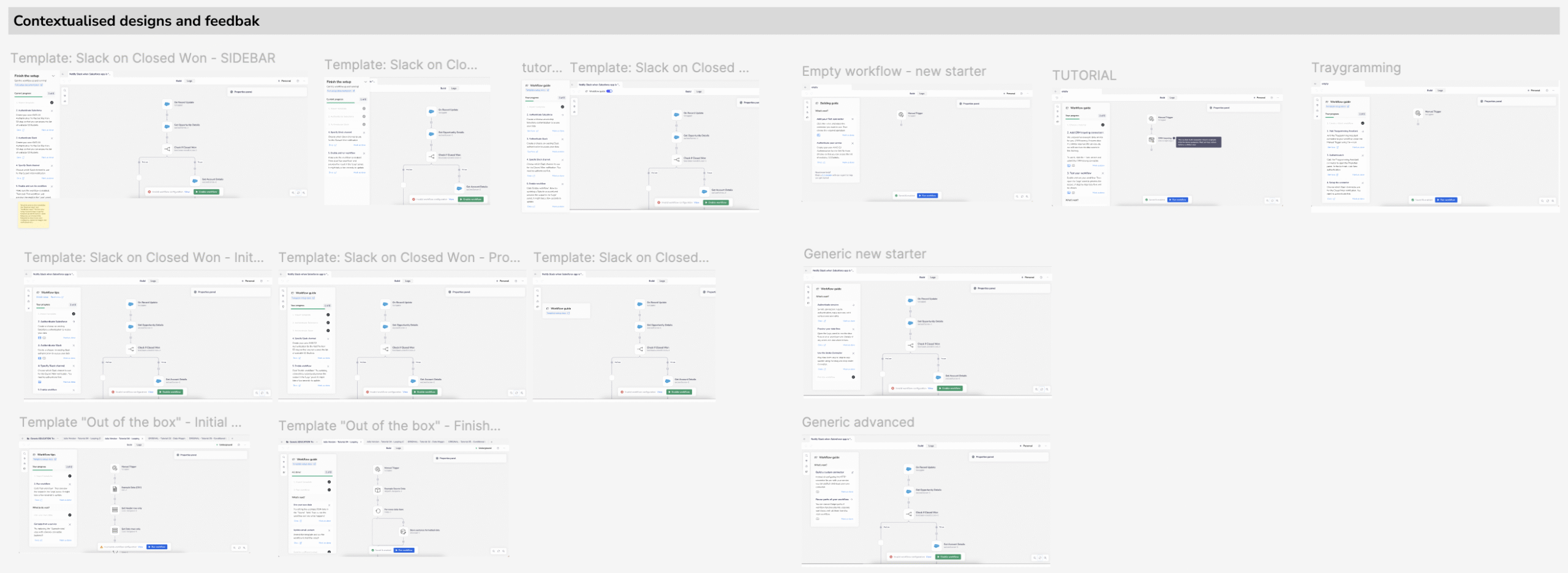
🎨 Contextualized Designs 🔁 Iterations & Testing
Post-requirements gathering, we developed contextualized designs and conducted internal and external testing. Feedback from these sessions informed iterative refinements, leading to the final design.
🚀 Released Solution
The side panel was successfully integrated, providing users with step-by-step guidance during workflow setup. This enhancement significantly improved user engagement and satisfaction.
📈 Impact and Results
The design improvements led to a significant increase in user engagement and satisfaction. Within the first 6 weeks of launch we have witnessed:
- Increased number of users running workflows after sign-up.
- Reduced support requests and negative feedback related to onboarding.
- Enhanced user understanding of workflow templates and connectors.
- Faster onboarding and reduced churn rates.
We also received overwhelmingly positive feedback from the Customer Success team, who found it easier to guide new users during demos.
🎓 Reflections
This project was a reminder that clarity beats power — especially in onboarding. While Tray.io offered deep functionality, new users needed a hand to unlock it. Our job as designers was to smooth the path without dumbing things down.
If I were to revisit this again, I’d push for even more personalisation in onboarding — perhaps an AI-guided assistant that adjusts based on user role or industry.
🌱 Future Possibilities
The project opens up strategic possibilities for further enhancements, including:
- Advanced analytics to track user interactions and optimize guidance.
- Integration of AI-driven recommendations for workflow improvements.
- Expansion of visual elements to cover more complex workflows.
The UX design improvements serve as a foundation for continuous growth and innovation, ensuring that no user is left without support and guidance at any point in their workflow journey.
📌 Takeaways
- Design isn’t just about aesthetics — it’s about reducing cognitive load
- Cross-functional collaboration was key to moving fast and getting it right
- Onboarding is a strategic lever for growth, not just a UX afterthought